legions-developer/evilcharts
EvilCharts
A shadcn-compatible chart component registry built on Recharts and Framer Motion, distributed as source code you copy into your project — not an npm package. Eight chart types and six UI primitives are installed individually via npx shadcn add @evilcharts/<name>, so you own the code and can customise every pixel.
Showcase


Features
Chart types
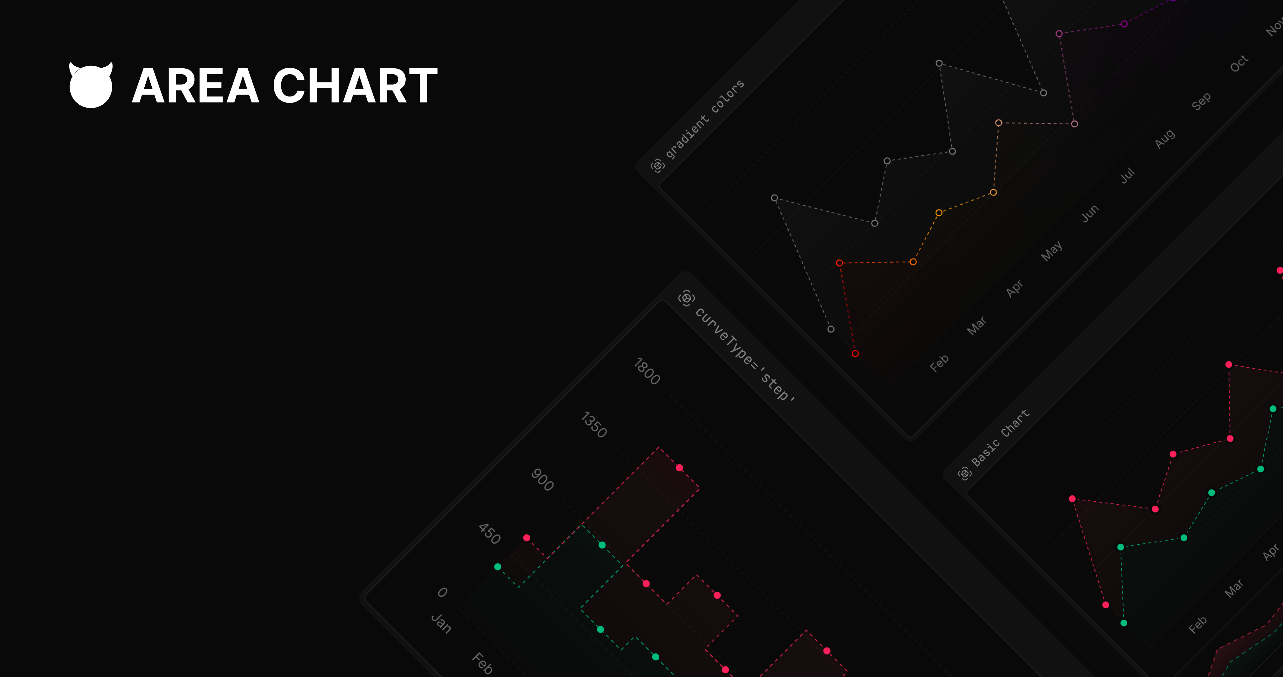
- EvilAreaChart — area chart with six
areaVariantfill styles: gradient, gradient-reverse, solid, dotted, lines, hatched. - EvilBarChart — bar chart with six
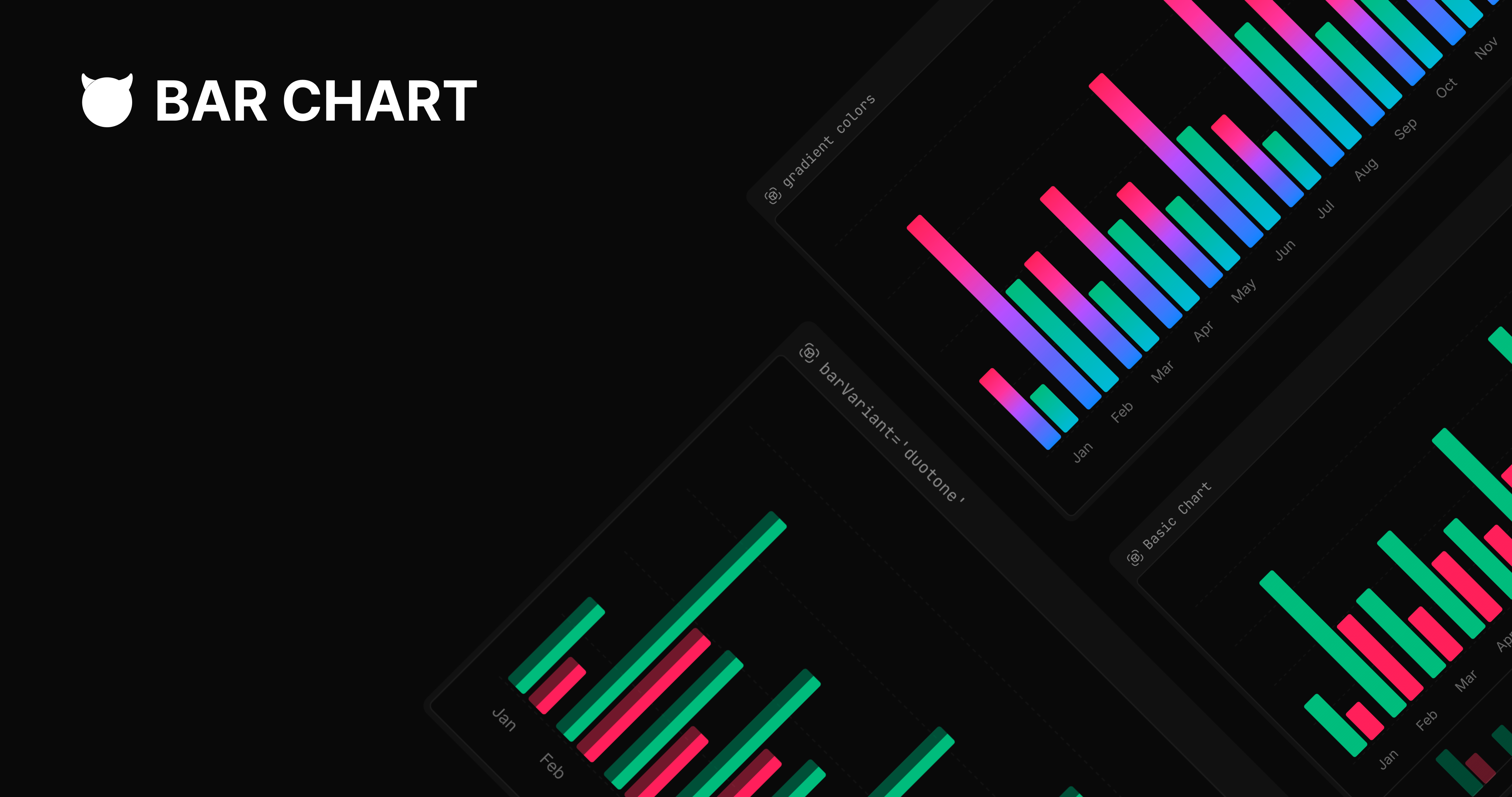
barVariantstyles (default, hatched, duotone, duotone-reverse, gradient, stripped) and vertical or horizontal orientation. - EvilLineChart — line chart with
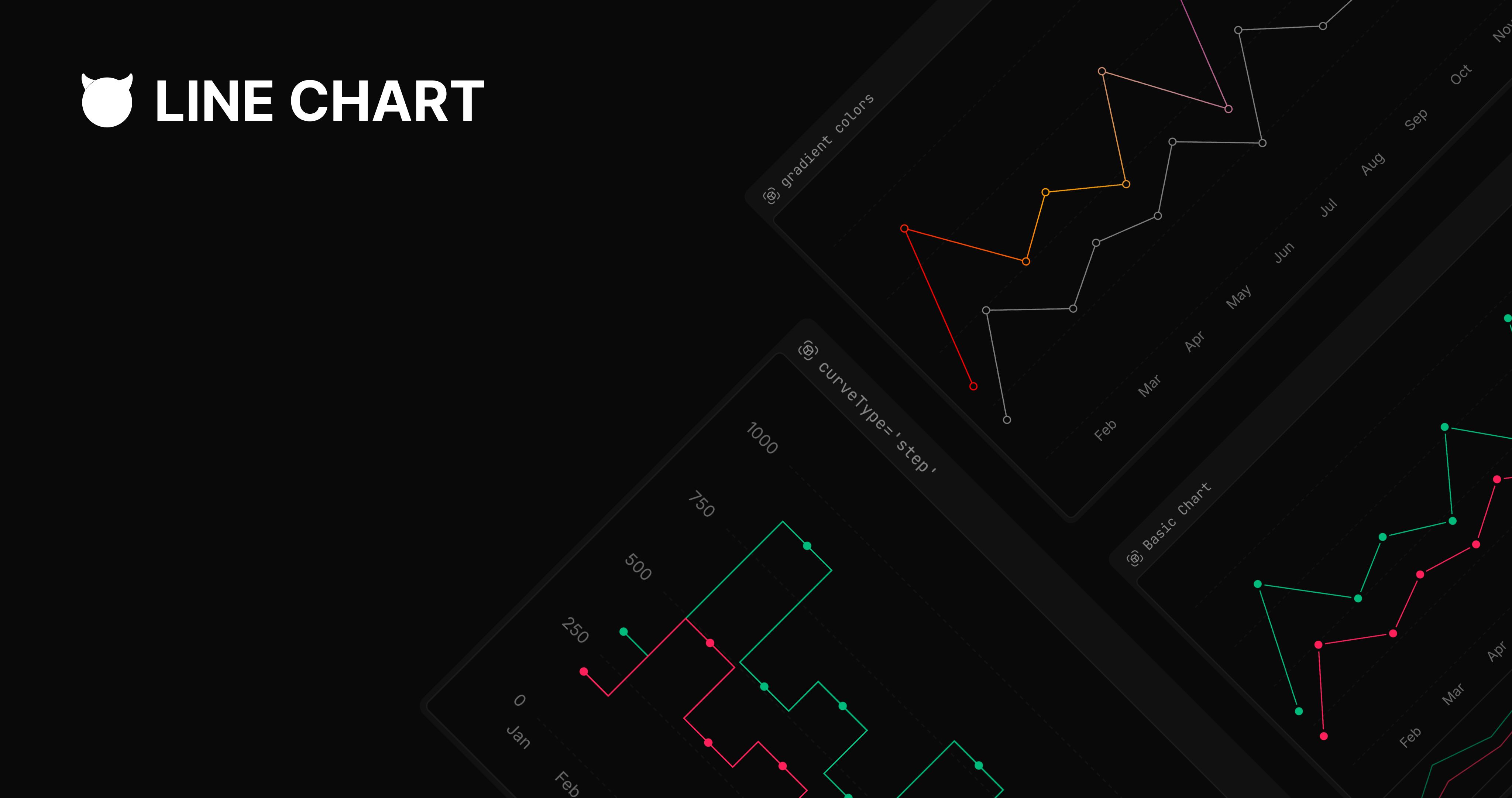
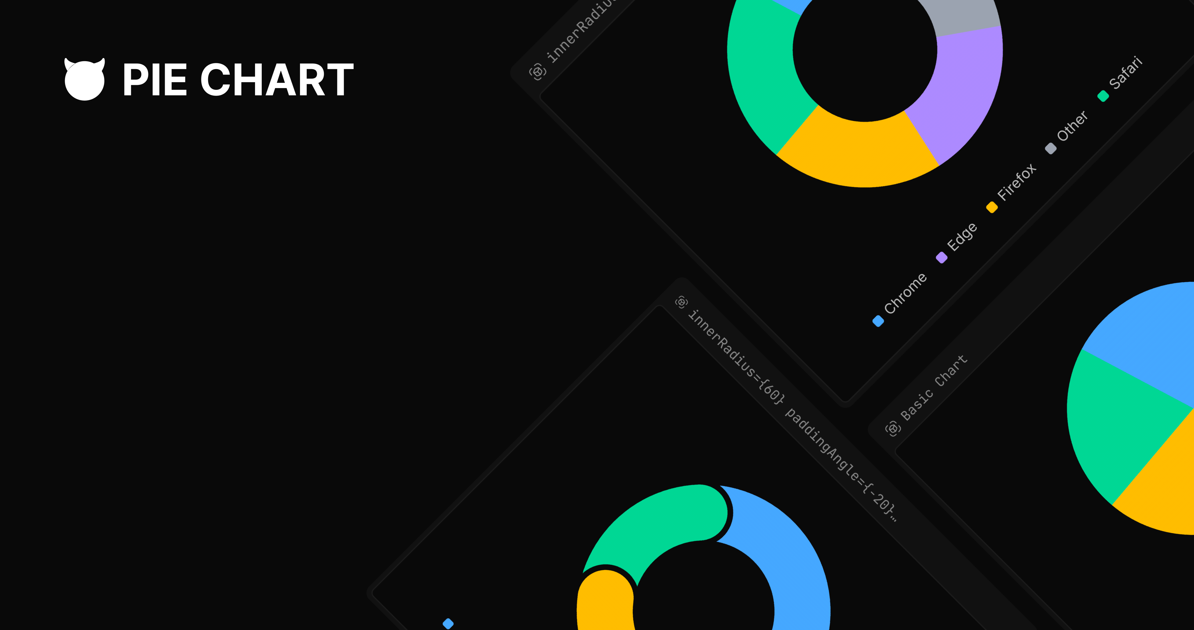
backgroundVariantsupport and a built-inEvilBrushrange selector viashowBrush. - EvilPieChart — pie and donut chart with donut, padded, overlapping, and with-labels variants.
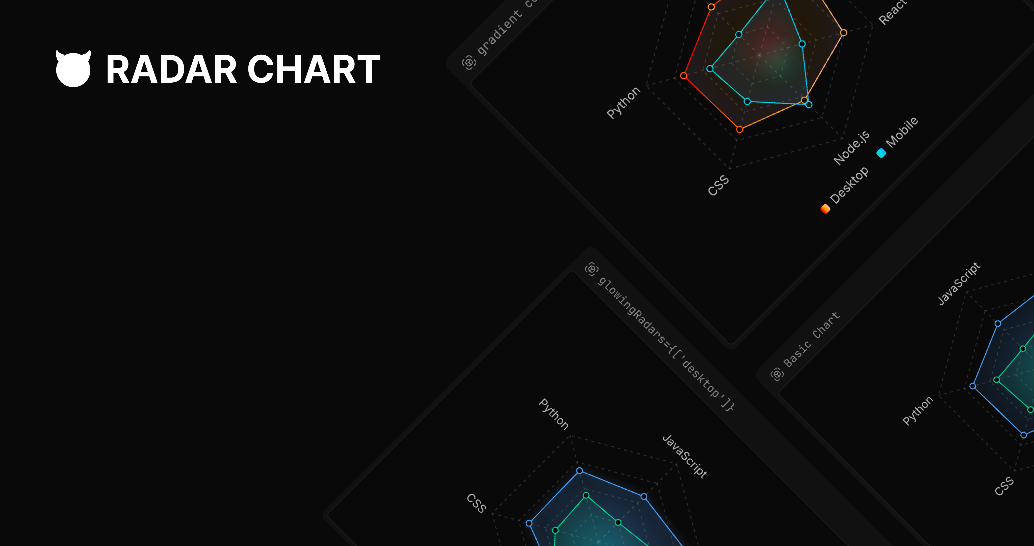
- EvilRadarChart — radar/spider chart with filled, lines, and circle-grid grid styles.
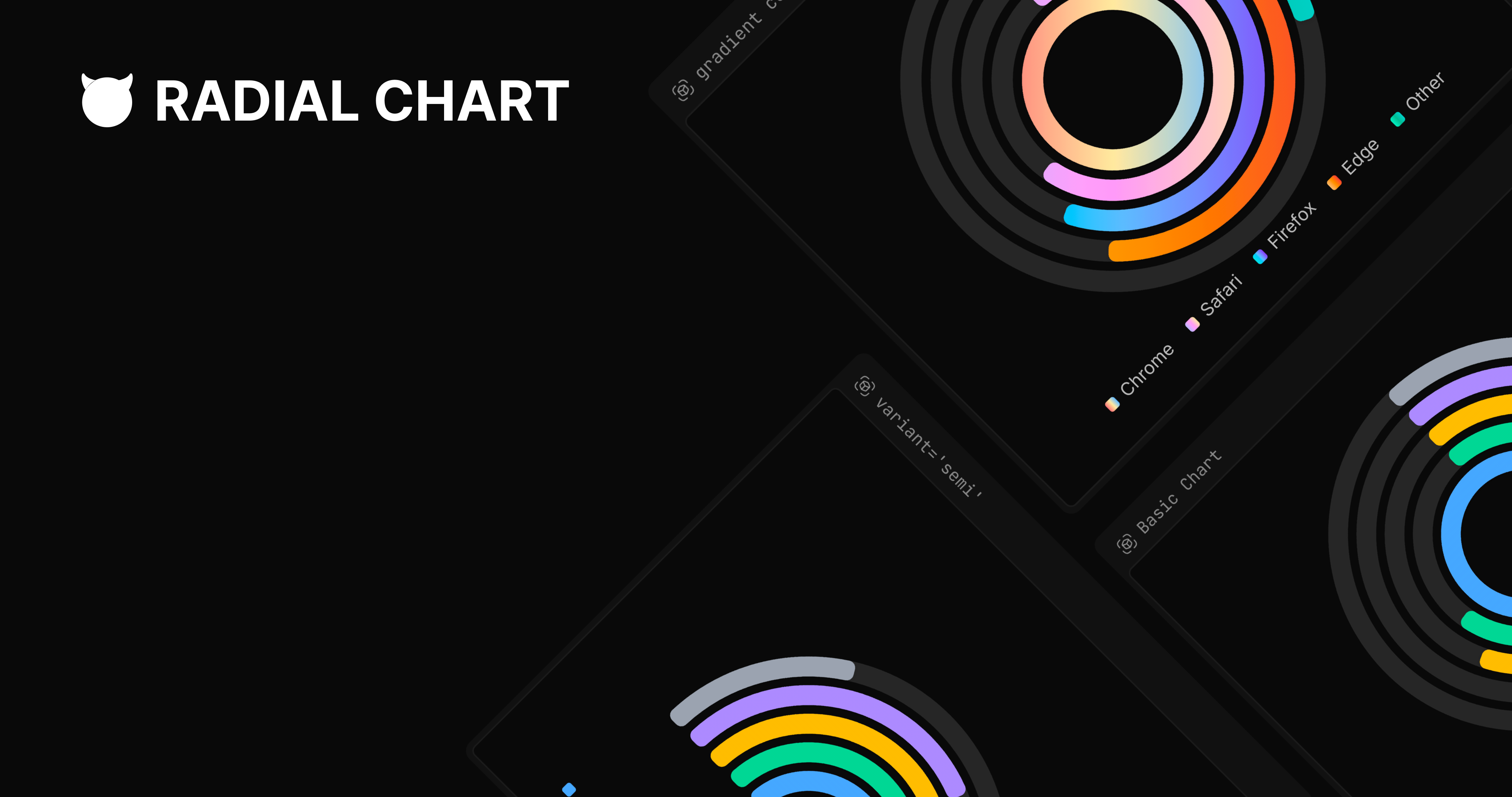
- EvilRadialChart — radial bar chart with full and semi-circle arc modes for gauge layouts.
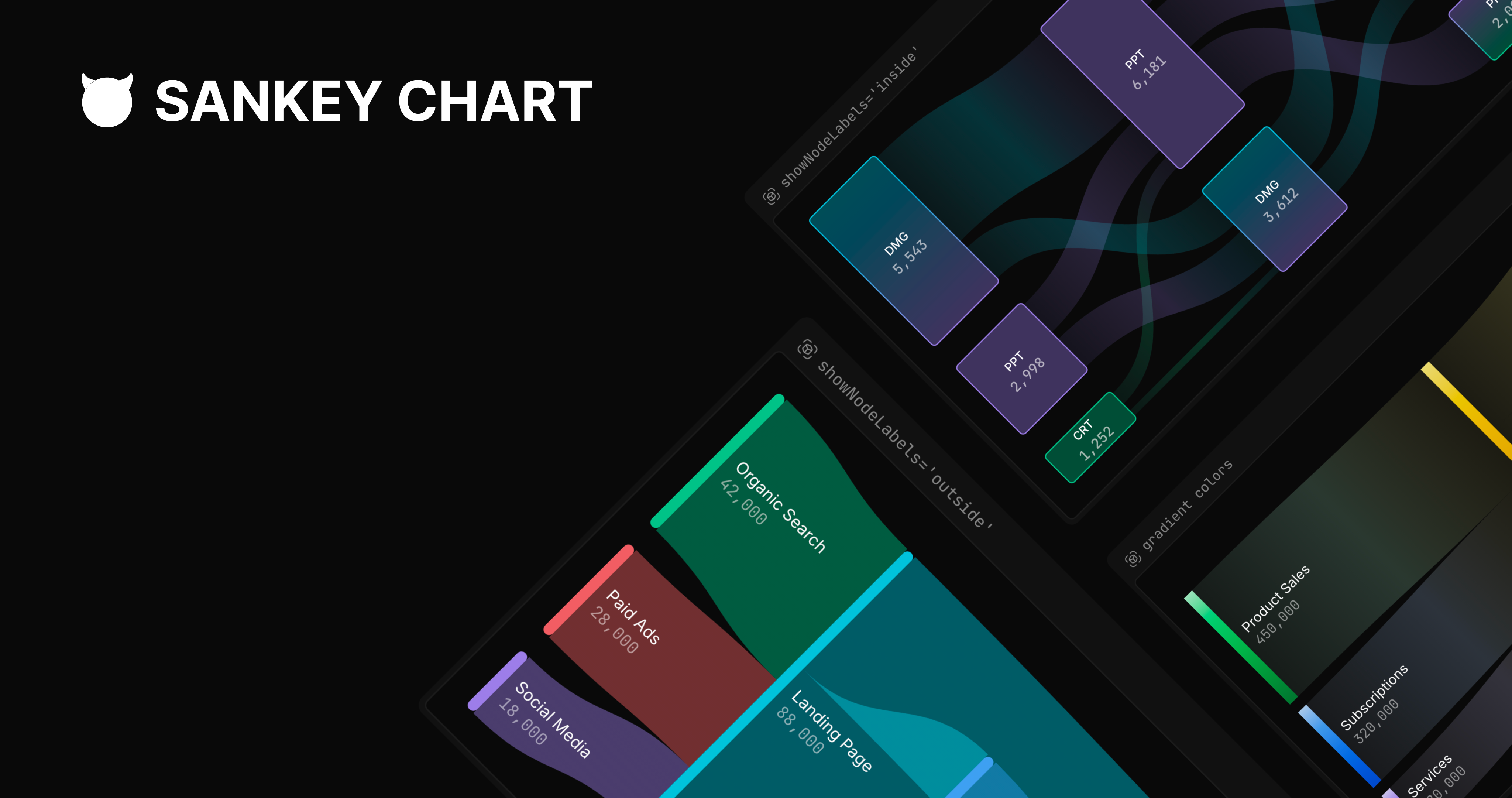
- EvilSankeyChart — Sankey flow diagram with configurable link rendering and node labels.
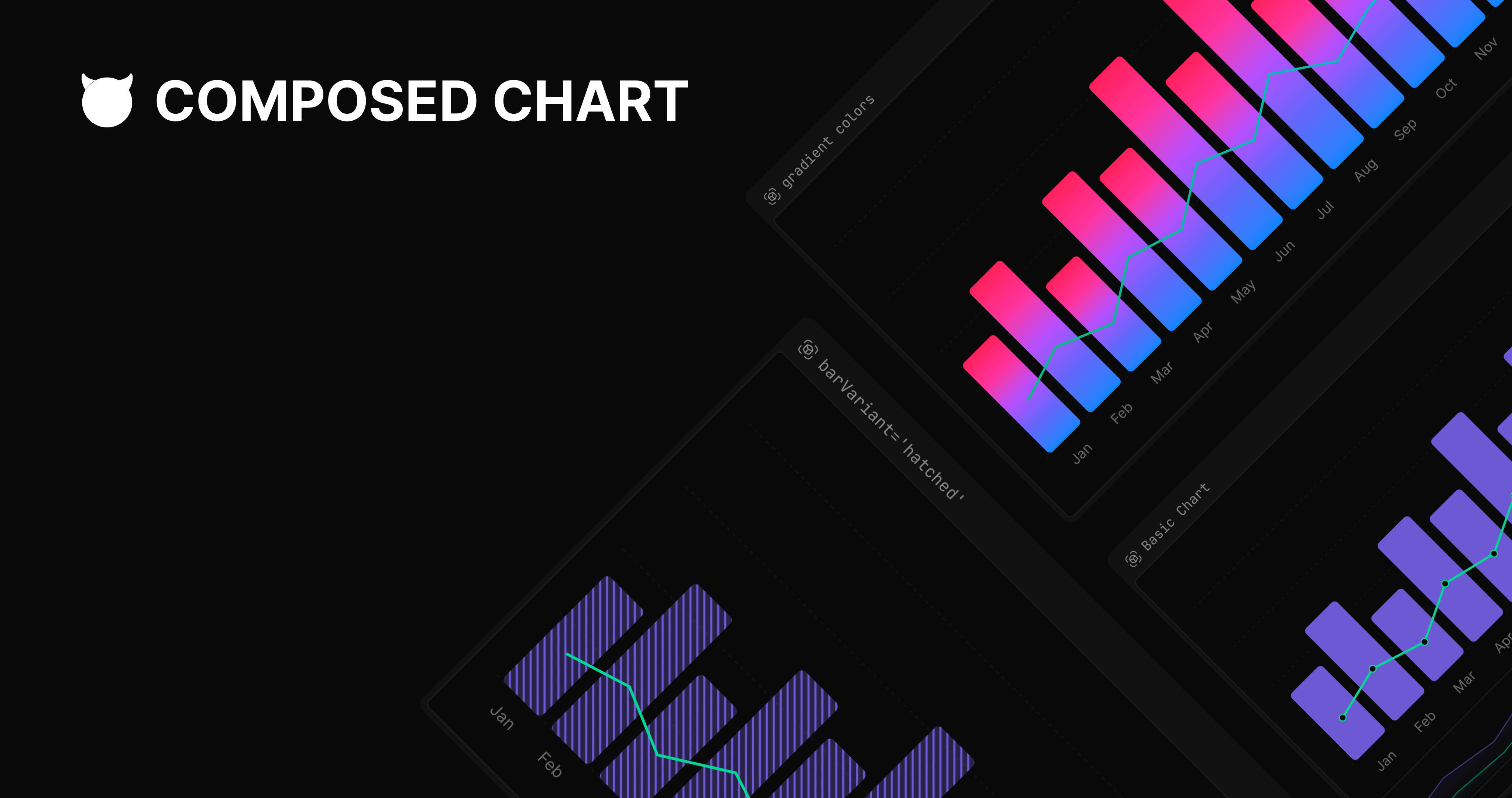
- EvilComposedChart — multi-series chart combining bar, line, and area in a single canvas.
UI primitives
- ChartContainer — root wrapper that injects scoped CSS custom properties (
--color-<key>-<index>) so multiple charts on the same page never bleed colors. - ChartTooltip — hover tooltip with
defaultandfrosted-glassvariants plus atooltipRoundnesscontrol. - ChartLegend — legend with seven
legendVariantmarker shapes: square, circle, circle-outline, rounded-square, rounded-square-outline, vertical-bar, horizontal-bar. - ChartDot — configurable dot marker for individual data points.
- EvilBrush — brush/range-selector primitive for interactive time-series zooming.
- Background — decorative SVG layer with eleven
backgroundVariantpatterns: dots, grid, cross-hatch, diagonal-lines, plus, falling-triangles, 4-pointed-star, tiny-checkers, overlapping-circles, wiggle-lines, bubbles.
Blocks (pre-composed layouts)
- Monospace Bar Chart — fixed-width bar layout styled for monospace aesthetic, with header and stats row.
- Hover Trace Bar Chart — bar chart with a hover-activated trace highlight overlay.
- Grid Bar Chart — bar chart with grid-aligned layout and animated growth.
Configuration
chartConfigobject maps each data key to a label, per-keycolorsarrays (separatelightanddarkpalettes), and an optional Lucideiconrendered in tooltips and legends.- Theme-aware color resolution: switching between light and dark mode automatically swaps the right palette via the generated CSS custom properties.
- Framer Motion mount animations on area fills, bar growth, and pie sector reveal.
Live examples
- EvilAreaChart demos — interactive variants
- EvilBarChart demos — interactive variants
- EvilLineChart demos — interactive variants
- EvilPieChart demos — interactive variants
- EvilRadarChart demos — interactive variants
- EvilRadialChart demos — interactive variants
- EvilSankeyChart demos — interactive variants
- EvilComposedChart demos — interactive variants
- Bar chart blocks — pre-composed block variants
Documentation
Full documentation at evilcharts.com/docs, built with Fumadocs. Covers installation, the chartConfig API, per-component prop reference, and an interactive variant playground for every chart type.
Quick start
# 1. Install Recharts (required peer dependency)
npx shadcn add recharts
# 2. Initialize shadcn/ui (skip if already set up)
npx shadcn@latest init
# 3. Add any chart component
npx shadcn add @evilcharts/area-chart
npx shadcn add @evilcharts/bar-chart
npx shadcn add @evilcharts/line-chart
# …and so on for each chart type
Tags
- Maturity
- BetaBetaActively developed but pre-1.0 — no stable release tagged yet.View all repositories tagged→
- Persona
- Design engineerDesign engineerEngineers with a design focus who build polished, opinionated UI from scratch.View all repositories tagged→Frontend engineerFrontend engineerEngineers building React, Vue, or other browser-side UIs and dashboards.View all repositories tagged→
- License Category
- UnknownUnknownNo LICENSE file detected and no licenseInfo from the GitHub API.View all repositories tagged→
- Built With
- Tailwind CSSTailwind CSSComponent styling written with Tailwind CSS utility classes.View all repositories tagged→FumadocsFumadocsDocumentation site built with Fumadocs — Next.js docs framework with MDX content.View all repositories tagged→shadcn/uishadcn/uiDistributed as a shadcn/ui-compatible component registry — installed via the shadcn CLI.View all repositories tagged→RechartsRechartsBuilt on Recharts — composable React charting library that wraps D3 SVG primitives.View all repositories tagged→Radix UIRadix UIUses Radix UI primitives (dialog, popover, tooltip, etc.) for accessible interaction surfaces.View all repositories tagged→Framer MotionFramer MotionAnimations powered by Framer Motion (the `motion` library) for chart mount transitions.View all repositories tagged→
- Security Posture
- UnratedUnratedOSSF Scorecard has not yet scanned this repository — security posture is unknown.View all repositories tagged→
- Maintainer Model
- Single-personSingle-personMaintained primarily by one developer — top contributor accounts for most commits.View all repositories tagged→
- Form Factor
- Component libraryComponent libraryA set of reusable UI components installed into the consumer's project, not a standalone application.View all repositories tagged→
- Platform
- WebWebRuns in the browser — renders to DOM/SVG/Canvas in a web page.View all repositories tagged→
- Use case
- Styled Recharts wrappers with design system qualityStyled Recharts wrappers with design system qualityWhen I want Recharts ergonomics with better aesthetics, I want pre-styled wrappers that still delegate to Recharts primitives, so I keep its API but skip the styling work.View all repositories tagged→Built-in brush range selector for time-series zoomBuilt-in brush range selector for time-series zoomWhen users need to drill into a specific time interval on a chart, I want a built-in brush range-selector, so they can zoom interactively without external state plumbing.View all repositories tagged→Decorative SVG background patterns for chartsDecorative SVG background patterns for chartsWhen I'm building a marketing landing page, I want a decorative pattern under my hero chart, so the visual feels editorial rather than functional.View all repositories tagged→Composed bar and line chartComposed bar and line chartWhen I'm comparing magnitude and trend on the same axis, I want a composed chart that mixes bar and line series, so I can show volume plus rate-of-change in one view.View all repositories tagged→Line chart with decorative SVG backgroundLine chart with decorative SVG backgroundWhen I'm presenting time-series data, I want a line chart with a decorative SVG background pattern, so the visualization stands out from generic Recharts output.View all repositories tagged→shadcn registry chart componentsshadcn registry chart componentsWhen I'm using shadcn/ui in my project, I want chart components I can add through the same `npx shadcn add` flow, so my dependency model stays consistent.View all repositories tagged→Donut and pie chart with label variantsDonut and pie chart with label variantsWhen I'm building a product analytics page, I want a donut chart with labels and padded segments, so users can see proportional breakdowns at a glance.View all repositories tagged→Animated chart components for React dashboardsAnimated chart components for React dashboardsWhen I'm building a Next.js analytics dashboard, I want to drop in animated chart components, so I can ship a visually polished metrics view without writing animation code.View all repositories tagged→Theme-aware chart color systemTheme-aware chart color systemWhen I'm shipping a dashboard with both light and dark themes, I want a chart system with theme-aware color arrays, so I don't have to wire palette swaps by hand.View all repositories tagged→Radial bar chart with semi-circle gauge modeRadial bar chart with semi-circle gauge modeWhen I'm building a fitness or goal-tracking UI, I want a semi-circle radial bar chart, so I can show progress toward a target as a gauge.View all repositories tagged→Frosted-glass tooltip variant for chartsFrosted-glass tooltip variant for chartsWhen I want hover tooltips with a frosted-glass look, I want a tooltip variant built into the chart components, so I avoid restyling Recharts' default tooltip from scratch.View all repositories tagged→Sankey flow diagram for ReactSankey flow diagram for ReactWhen I need to show categorical flow between sources and destinations, I want a Sankey diagram component for React, so I can ship without integrating d3-sankey by hand.View all repositories tagged→Chart legend with custom marker shapesChart legend with custom marker shapesWhen my chart legend needs to match a specific marker shape, I want legends with circle, rounded-square, or vertical-bar markers, so the legend visually echoes the data series style.View all repositories tagged→Tailwind-styled chart componentsTailwind-styled chart componentsWhen I want my chart styling to live alongside my Tailwind utility classes, I want chart components written with Tailwind, so styling stays in one place.View all repositories tagged→Radar chart with circle-grid stylingRadar chart with circle-grid stylingWhen I'm building a skill matrix or capability comparison UI, I want a radar chart with circle-grid styling, so I can plot multiple dimensions per entity.View all repositories tagged→Pre-composed chart blocks ready to drop inPre-composed chart blocks ready to drop inWhen I'm prototyping a chart layout under deadline, I want pre-composed chart blocks I can drop in, so I can ship a fully-styled chart section without assembling primitives.View all repositories tagged→CSS-variable-driven chart palette swapsCSS-variable-driven chart palette swapsWhen I want to render charts that re-style under a new design system without re-writing them, I want components whose colors come from scoped CSS variables, so a CSS-only palette swap restyles every chart at once.View all repositories tagged→React client components for Next.js App RouterReact client components for Next.js App RouterWhen I'm building a Next.js App Router app, I want chart components compatible with `"use client"` boundaries, so I can co-locate charts with server-fetched data without runtime warnings.View all repositories tagged→Extended shadcn chart registry with more chart typesExtended shadcn chart registry with more chart typesWhen I'm extending shadcn/ui's limited chart set, I want richer chart variants (sankey, radial, composed) in the same registry style, so I'm not blocked by what shadcn ships out of the box.View all repositories tagged→Copy-paste chart source into your repoCopy-paste chart source into your repoWhen I want full ownership of my chart code, I want chart components installed as source files in my repo, so I can modify every line without forking a library.View all repositories tagged→Charts with hatched and textured fillsCharts with hatched and textured fillsWhen I want my charts to look intentionally designed instead of generic, I want bar fills with hatching, duotone, or stripes, so my dashboard reads as handcrafted rather than off-the-shelf.View all repositories tagged→Per-chart CSS variable scopingPer-chart CSS variable scopingWhen I'm rendering many charts on one page, I want each chart's color palette scoped to its own container, so colors don't bleed between widgets on the same page.View all repositories tagged→
- Ecosystem
- JavaScriptJavaScriptBuilt with JavaScript, runs in the browser or any JS runtime.View all repositories tagged→TypeScriptTypeScriptStatically typed superset of JavaScript compiled to JS, used for large-scale Node.js and frontend applications.View all repositories tagged→ReactReactIntegrates with React, exposing UI as idiomatic React components.View all repositories tagged→Next.jsNext.jsTargets the Next.js React framework — App Router, Server Components, server actions.View all repositories tagged→
- Status
- ActiveActiveReceives recent commits and releases, issues are being addressed.View all repositories tagged→
- Features
- Pie ChartPie ChartPie and donut chart with donut, padded, overlapping, and with-labels variants.View all repositories tagged→Line ChartLine ChartLine chart component with decorative SVG background pattern support and brush range selector.View all repositories tagged→Radar ChartRadar ChartRadar/spider chart with filled, lines, and circle-grid styling variants.View all repositories tagged→Tooltip VariantsTooltip VariantsChart tooltip with default and frosted-glass visual variants plus a tooltipRoundness control.View all repositories tagged→Bar ChartBar ChartBar chart component with six fill variants and vertical or horizontal orientation.View all repositories tagged→Decorative Chart BackgroundsDecorative Chart BackgroundsEleven SVG background pattern variants — dots, grid, cross-hatch, diagonal lines, plus, falling triangles, stars, checkers, circles, wiggle lines, bubbles.View all repositories tagged→Theme-aware Chart ColorsTheme-aware Chart ColorschartConfig maps each data key to per-theme light/dark color arrays via scoped CSS custom properties.View all repositories tagged→shadcn Registry Distributionshadcn Registry DistributionComponents installed as owned source code via the shadcn CLI — not as a versioned npm package.View all repositories tagged→Radial ChartRadial ChartRadial bar chart with full and semi-circle arc modes, suitable for gauges and progress rings.View all repositories tagged→Pre-composed Chart BlocksPre-composed Chart BlocksDrop-in chart blocks (Monospace, Hover Trace, Grid bar charts) with header, stats, and animations included.View all repositories tagged→Area ChartArea ChartInteractive area chart component with six fill style variants — gradient, solid, dotted, lines, hatched.View all repositories tagged→Chart Mount AnimationsChart Mount AnimationsBuilt-in Framer Motion animations for area fills, bar growth, and pie sector reveal on mount.View all repositories tagged→Sankey DiagramSankey DiagramSankey flow diagram with configurable link rendering and node labels.View all repositories tagged→Chart Brush Range SelectorChart Brush Range SelectorEvilBrush primitive lets users zoom into a sub-range of a time-series chart interactively.View all repositories tagged→Composed ChartComposed ChartMulti-series chart combining bar, line, and area in a single canvas.View all repositories tagged→Legend Marker VariantsLegend Marker VariantsChart legend with seven marker shape variants — square, circle, outline, rounded, vertical bar, horizontal bar.View all repositories tagged→
Documentation
21 pages indexed · 1,676 words▶READMEEvilCharts — READMEgithub.com/legions-developer/evilcharts/blob/main/README.md↗
EvilCharts
A chart UI component registry for React and Next.js, distributed via a shadcn-compatible CLI. Users install source code directly into their projects rather than depending on an npm package. Built with Recharts and Framer Motion (motion). Features Bar, Line, Area, Pie, Radar, Radial, Sankey, and Composed chart types, plus UI primitives (chart container, tooltip, legend, dot, evil-brush, background) with extensive visual variant support.
▶Introductionevilcharts.com/docs↗
Introduction
EvilCharts is an open-source chart UI website built with shadcn and Recharts, beautifully designed and handcrafted.
Built with Recharts and Shadcn. Motivated by the lack of beautiful, animated chart components in the React ecosystem. The name 'Evil' signals unapologetically opinionated UI choices, design-first animated and unique designs, handcrafted with SVGs and Framer Motion to stand out.
The Problem
As a design engineer, I see ugly and common charts everywhere, and no one in the community is creating a beautiful chart library. There are tons of chart libraries out there, but none of them are beautiful — even though they allow customization, I see that no one is customizing them and they just use them as provided via docs.
Built on Recharts
While finalising the design for EvilCharts, I wanted a good headless chart library. Recharts has amazing features and is easy to use in every project.
▶Installationevilcharts.com/docs/installation↗
Installation
EvilCharts uses a shadcn-compatible registry. There is no npm package to install — components are copied directly into your project as source files.
Steps
- Install Recharts — the charting engine that powers EvilCharts:
npx shadcn add recharts - Setup shadcn/ui — initialise Tailwind CSS, theme configuration and component structure:
npx shadcn@latest init - Add EvilCharts components via the registry CLI:
npx shadcn add @evilcharts/{chart-name}(e.g.@evilcharts/area-chart,@evilcharts/bar-chart,@evilcharts/line-chart,@evilcharts/pie-chart,@evilcharts/sankey-chart,@evilcharts/radial-chart,@evilcharts/radar-chart,@evilcharts/composed-chart)
Requirements: Next.js project, shadcn/ui initialised, Recharts installed.
- Install Recharts — the charting engine that powers EvilCharts:
▶Chart Configevilcharts.com/docs/chart-config↗
Chart Config
The
chartConfigis a central configuration object accepted by every Evil Chart component. It maps each data key in your dataset to its display metadata — labels, colors (with light/dark theme support), and optional icons that appear in tooltips and legends.Properties
- label — a human-readable name (string or React.ReactNode) displayed in tooltips and legends.
- colors — theme-aware color arrays. Provide
lightand/ordarkarrays of CSS color strings. A single color gives a solid fill; multiple colors create gradient fills evenly distributed across chart segments. - icon — optional React component that replaces the default color indicator in both tooltip and legend.
Runtime Validation
The chart config is validated at runtime. Passing an empty colors object or one without a valid theme key produces a clear error message.
Color Distribution
When fewer colors are provided than chart segments need, colors are evenly distributed across slots. This allows 2-3 gradient stops to span any number of data points.
▶Area Chartevilcharts.com/docs/area-chart/static↗
Area Chart
The
EvilAreaChartcomponent renders filled area charts with extensive visual variants.Stack types
stackType: 'default'— independent areasstackType: 'stacked'— areas stacked on top of each otherstackType: 'expanded'— 100% stacked
Curve types
bump,step,monotoneY
Stroke variants
solid,dashed,animated-dashed
Area fill variants
gradient,gradient-reverse,solid,dotted,lines,hatched
Dot variants
border,colored-border
Other options
showBrush— adds a range brush beneath the chart for zoomingisClickable— enables click interactions on data pointsisLoading— pass empty data array to show loading skeletonactiveDotVariant— controls the highlighted dot style on hover
Install:
npx shadcn add @evilcharts/area-chart▶Line Chartevilcharts.com/docs/line-chart/static↗
Line Chart
The
EvilLineChartcomponent renders line charts with extensive visual customisation.Stroke variants
solid,dashed,animated-dashed
Curve types
bump,step,monotoneY
Dot variants
border,colored-border
Glow effects
- Per-series configurable glow on lines and dots
Background variants (via
backgroundVariantprop)dots,grid,cross-hatch,diagonal-lines,plus,falling-triangles,4-pointed-star,tiny-checkers,overlapping-circles,wiggle-lines,bubbles
Other options
showBrush,isClickable,isLoading,activeDotVariant- Gradient colors — pass multi-stop color arrays per theme
- Buffer/loading state animation
Install:
npx shadcn add @evilcharts/line-chart▶Bar Chartevilcharts.com/docs/bar-chart/static↗
Bar Chart
The
EvilBarChartcomponent renders bar charts with extensive variant support.Bar variants
default,hatched,duotone,duotone-reverse,gradient,stripped
Chart types
stacked,percent(100% stacked),horizontallayout
Interactions
- Hover highlight — dims non-hovered bars
- Click interactions (
isClickable) - Loading state animation (
isLoading)
Glow effects
- Per-series configurable glow on bars
Other options
showBrush, gradient colors,tooltipDefaultIndex
Install:
npx shadcn add @evilcharts/bar-chart▶Composed Chartevilcharts.com/docs/composed-chart/static↗
Composed Chart
The
EvilComposedChartcombines bar and line series in a single chart.Bar variants
hatched,duotone,duotone-reverse,gradient,stripped
Stroke variants
dashed,animated-dashed
Curve types
bump
Interactions
- Hover highlight, dot overlays, glow effects
- Click interactions, loading state animation
Gradient colors
- Multi-stop color arrays per series per theme
Install:
npx shadcn add @evilcharts/composed-chart▶Pie Chartevilcharts.com/docs/pie-chart/static↗
Pie Chart
The
EvilPieChartcomponent renders pie and donut charts.Variants
donut— hollow centre ring chartpadded— segments with angular padding between themoverlapping-padded— overlapping ring segmentslabels— pie slices with external percentage labels
Effects
- Glow effect per series
- Gradient color fills
Interactions
- Click interactions, loading state animation
Install:
npx shadcn add @evilcharts/pie-chart▶Radar Chartevilcharts.com/docs/radar-chart/static↗
Radar Chart
The
EvilRadarChartcomponent renders spider/radar charts for multi-dimensional data.Variants
filled— solid filled polygonlines— outline onlycircle-grid— circular grid lines instead of polygon grid
Effects
- Gradient color fills
- Glow effect per series
Interactions
- Click interactions, loading state animation
dotVariant,activeDotVariant
Install:
npx shadcn add @evilcharts/radar-chart▶Radial Chartevilcharts.com/docs/radial-chart/static↗
Radial Chart
The
EvilRadialChartcomponent renders radial bar charts — concentric arc segments showing proportional values.Variants
full— 360° arcssemi— 180° half-circle arcs
Effects
- Gradient color fills
- Glow effect per series
Interactions
- Click interactions, loading state animation
Install:
npx shadcn add @evilcharts/radial-chart▶Sankey Chartevilcharts.com/docs/sankey-chart/static↗
Sankey Chart
The
EvilSankeyChartcomponent renders Sankey flow diagrams — nodes connected by weighted links that visualise how quantities flow through a system (e.g. marketing funnels, energy transfers, budget allocations).Link variants
default— gradient-filled curved linkssolid— uniform color linkssource— link inherits source node color
Node label variants
inside— labels inside nodesoutside— labels positioned outside
Effects
- Gradient colors per node/link
- Glow effect
Interactions
- Loading state animation
Install:
npx shadcn add @evilcharts/sankey-chart▶Bar Blocks — Monospace Bar Chartevilcharts.com/docs/bar-chart/blocks↗
Monospace Bar Chart
A design-opinionated bar chart with a monospaced terminal aesthetic. Bars animate on mount with a spring scale-X animation; each active bar collapses to a thin line when inactive and expands to full width when hovered. Uses Framer Motion
AnimatePresenceandmotion.rectfor transitions. Includes a header with total and peak-month stats formatted in monospace typography.Install:
npx shadcn add @evilcharts/monospace-bar-chart▶Bar Blocks — Hover Trace Bar Chartevilcharts.com/docs/bar-chart/blocks↗
Hover Trace Bar Chart
An interactive bar chart with a floating reference line that tracks the hovered value. A spring-animated NumberFlow counter updates as you move between bars. Inactive bars fade to 20% opacity while the active bar shows a border and full opacity. A floating label pill on the right axis edge displays the current value.
Install:
npx shadcn add @evilcharts/hover-trace-bar-chart▶Bar Blocks — Grid Bar Chartevilcharts.com/docs/bar-chart/blocks↗
Grid Bar Chart
A bar chart where each bar is rendered as a stack of 10×10px square grid cells rather than a solid rectangle. Ghost squares fill the full column height in low opacity, while data squares fill from the bottom up. Includes a monospace header with total and peak stats.
Install:
npx shadcn add @evilcharts/grid-bar-chart▶Background UI Primitiveevilcharts.com/docs/ui/background↗
Background
The
backgroundUI primitive adds a decorative background pattern behind chart content. Controlled viabackgroundVariantprop on any Evil Chart component.Available variants
dots— scattered dot gridgrid— square grid linescross-hatch— diagonal crosshatch patterndiagonal-lines— parallel diagonal stripesplus— plus-sign tile patternfalling-triangles— triangular tessellation4-pointed-star— star tile patterntiny-checkers— fine checkerboardoverlapping-circles— interlocking circle patternwiggle-lines— wavy horizontal linesbubbles— circle cluster pattern
Install:
npx shadcn add @evilcharts/background▶Legend UI Primitiveevilcharts.com/docs/ui/legend↗
Legend
The
legendUI primitive renders a chart legend identifying each data series. Controlled vialegendVariantprop.Variants
square— filled square indicatorscircle— filled circle indicatorscircle-outline— circle with border, no fillrounded-square— rounded rectangle fillrounded-square-outline— rounded rectangle border onlyvertical-bar— thin vertical line indicatorhorizontal-bar— thin horizontal line indicator
Install:
npx shadcn add @evilcharts/legend▶Tooltip UI Primitiveevilcharts.com/docs/ui/tooltip↗
Tooltip
The
tooltipUI primitive renders interactive data tooltips on hover. Controlled viatooltipVariantandtooltipRoundnessprops.Variants
default— solid background tooltipfrosted-glass— semi-transparent backdrop-blur tooltip for a glass effect
Roundness
sm,md,lg,xl
Other options
hideLabel— hides the category label at the tophideIndicator— hides the color dot/line next to each itemindicator— style of color indicator:line,dot, ordashedtooltipDefaultIndex— pre-highlights a specific data point on load
Install:
npx shadcn add @evilcharts/tooltip▶Chart Container UI Primitivegithub.com/legions-developer/evilcharts/blob/main/src/registry/ui/chart.tsx↗
Chart (ChartContainer)
The core
chartUI primitive provides theChartContainerwrapper component andChartConfigTypeScript type. All Evil Chart components are built on top of this container, which injects theme-aware CSS custom properties scoped to each chart instance (--color-<key>-<index>) and provides the context that tooltip and legend primitives read from.Install:
npx shadcn add @evilcharts/chart▶Dot UI Primitivegithub.com/legions-developer/evilcharts/blob/main/src/registry/ui/dot.tsx↗
Dot
The
dotUI primitive renders data-point dot markers on line and area charts. Supportsbordervariant (outlined dot) andcolored-bordervariant (color-matched border). Active dot appearance is controlled viaactiveDotVariant.Install:
npx shadcn add @evilcharts/dot▶Evil Brush UI Primitivegithub.com/legions-developer/evilcharts/blob/main/src/registry/ui/evil-brush.tsx↗
Evil Brush
The
evil-brushUI primitive adds a range selector brush beneath line and area charts. Enabled viashowBrushprop on area and line chart components. Allows users to zoom into a time range. ThebrushFormatLabelprop customises the label displayed on the brush handles.Install:
npx shadcn add @evilcharts/evil-brush